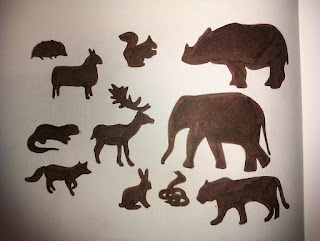
The new brief for developing illustration practise is to design a CD cover front and back. We could choose any music that we liked. The music that I choose was Laura Marling and Mumford and Sons collaborating with the Indian Dharohar Project. This is a mixture between contemporary British Folk and Indian Folk music.
The idea behind the first image was trying to and show both the British and Indian elements. The first way that I thought of ding this was with animals due to the fact that the wildlife of Britain and India are so distinctly different. In the first image the British wildlife is on the left or the West facing the Indian wildlife on the right or the East.
The second image is the same as the first only this time the wildlife is coloured based on the flag of the country that it is from.
For the third image i created a similar piece to the first only this time the animals are more stylised in there form. I wanted to do this to show the contemporary element of the music.
The fourth image is the same as the third but this time in a similarly way to the second image I have used the colours of the countries flag only this time just an outline which I think works much better that the full colour.
I also looked at the different instruments used by the British folk artists and the Indian. In the fifth image I used water colour paints an a thin fine liner pen to outline the collection of instruments. In the sixth image I used a similar style as before in the placement of the images and used the brown fine liner again.
In the last image I was looking at ways in which I could add typography to the cover.


